


Redesign and improvements for the MS Space tool
Microsoft Digital Campus / CSEO (Core Services, Engineering, and Operations)
Microsoft internal application, 2021
The MS Space tool is a web based application that allows administrators to manage building data for Microsoft worldwide. It focuses information like on purchases and decommissions, classifications, points of contact, addresses, and features, among others.
Refitting it with a fresh look and design improvements was a complex problem, deceptively so given its visual simplicity, in that being built over 30 years ago instills it with bugs and stale features, each of which needed to be checked for necessity versus feature removal. The tool has both old but important data, but also types and nomenclature of data that need to be considered when doing any changes to the design and function of features, basically so it doesn't break when calling retro data. Additionally, it's dependent on data from external sources, like SAP Real Estate, that have variables and schemas that need to be considered at each step.
Redesigning is a two pronged approach
one of the maine challanges unique to REdesiging a site that is so data heavy is that each built feature needs to be examined through and through to make sure of its need, use, impact, and the conswquences of any changes.
My course of action and ownership
I set about by first doing an extensive audit, both visually on my own of each page and subpage, fuctionality, and feature, looking for easy outliers and improvements, and also with key power users in workflow, basically the team members that collaborated around this tool. I then set about proposing a course of action to PM design leadership, outlining my findings and recommendations. This included a research plan that could be used by other PM teammates, given possible bandwidth, do conduct on their own.
I continued research with SME's, to thoroughly understand the function of each input and feature, and would circle back with them for validation at many points int he project.
Writing all of the the technical copy, I made sure to refer to SME's for accuracy, and tracked and maintained the copy through shipping.
I owned the design contribution of the effort outright, with minimal oversight save where needed from my design leadership. One challenge, both political and managerial, was that ENG put pressure on the project to take on page by page, piece-meal, rather than doing more extensive AI and wire-framing upfront. Needing to balance the needs of our teams, this meant that I took on individual page redesigns while at the same time mapping larger workflows, and anticipating issues and paradoxes on interconnected, site-wide flows. While not an ideal working plan, my cohesion, forward thinking, and cross team alignment helped keep the project together and sound.
Shown here a few examples of pages and features, out of the roughly 40 pages that were redesigned.
Site landing page of previous build

I conducted numerous interviews to understanding how the old site worked and why, to see how the pages interrelated, and especially what could be excised for simplicity and ease of use. Where possible, I shifted the architecture of navigation as well, to clump various like pages.
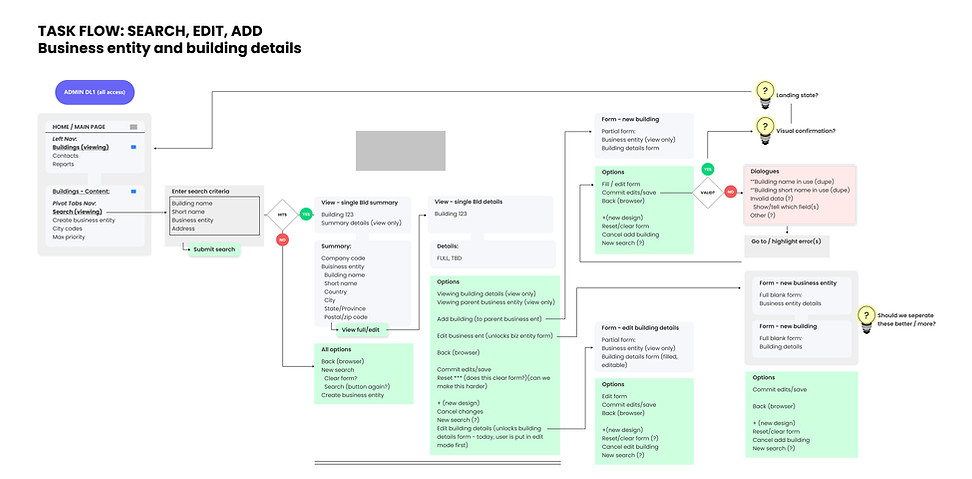
Detailed site maps and task flows helped investigate in detail the process and logic by which the app worked, uncovered new features proposals and questions of design and business value, and acted as a aligning point of truth with the engineering team.
Visual design and hierarchy, feature placement, and site navigation were only a few of the issues with the previous build. The dropdown logic tree broke that rule of design in which users are allowed to choose a combination of paradoxical search settings which only compute an error after being executed, for example "30GARAGE" (US), "1032 CHILE (Chile), and Badghis (Afghanistan), with some random postal code.


I redesigned the layout, copy, and navigation, and set the rules for users to have the choice of starting criteria from dropdowns of their choice where available, greyed out the unavailable options that were contingent on starting criteria, and set the dropdown lists to be dependent on the limits inherent in users' first choices. For example, if they selected a Building Name, Short Name becomes unavailable, and if they start with Country, only those buildings are available.
This is basic design good practice, but significant work was done with engineering to show value and to ensure it was implemented correctly.

After search, the original results grid page with an antiquated look at passable navigation.

II designed a grid, using and tweaking an available component, that was optimal for most screens. By testing out lengths of the shorter and longest column entries in characters, and optimizing for a common screen size, I redlined the column widths to balanced showing enough characters to identify the column name/value, while fitting all of the columns available on one page.

Base on both user feedback and exploring a business case value, I designed a feature to customize column order and type, by using a Side Pane with choices. This was a balance between opting for a design best practice while tuning into user asks. For example, standard columns are checked automatically, as is shown in the grid, and users can all of them except the Building Name, whose order and display is unchangeable (based on user feedback from SME's). All other column types and order can be added and moved, with an existing Click/Drag component, and with Resets. Additional, based on user research, the Customization is both retained with the user's profile for the next session, and is retained when Exporting to Excel.


The View Building page was the largest and longest form entry page, with a long scroll and an overwhelming amount of information. However, I chose to keep the visuals and layout similar, as it was actually preferred by users to have the complete information in one place.
The big changes I did make were to propose and implement a read-only "View Building" page, rather than the current in which the user is viewing data and has edit abilities at the same time. Having a View Only building page and forcing users to more deliberately enter the Edit Mode ensures less accidental edits or errors made by unfamiliar users.

The resulting two screens, View Building and Edit Building, are a clean new look, now with two columns where possible, vastly reducing page length.
View Building

Edit Building

The resulting two screens, View Building and Edit Building, are a clean new look, now with two columns where possible, vastly reducing page length.